
NaBloPoMo 2018: What I’m Learning
Funny how fear crops up sometimes. It’s especially distressing when you fear your own ‘team.’ But we are here to learn and grow, so we step forward. My point in this post is to practice critical appraisal of research data before accepting or integrating it; especially if I am biased toward it.
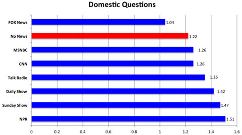
A fellow progressive Facebook group member posted this photo with a message of glee and encouraging everybody to disseminate. I admit I also initially felt justified and righteous when I saw it. But something kept me from sharing on my own page. I should do this more often, perhaps—let something marinate for 24 hours before sharing, just to make sure it’s really something I want to engage with. I ended up commenting that I think we should be careful about disseminating this kind of oversimplified graphic, as the data may not justify the claim. I await the angry backlash.
After reading the article in Business Insider from whence the figure came, I had more questions than answers. What are Farleigh Dickinson University and Public Mind, anyway? “Researchers asked 1,185 random nationwide respondents what news sources they had consumed in the past week and then asked them questions about events in the U.S. and abroad.” What were the questions? How were they chosen, and how do we know they represent broader knowledge of current events? “With all else being equal, people who watched no news were expected to answer 1.28 [out of 5] correctly; those watching only Sunday morning shows figured at 1.52; those watching only ‘The Daily Show’ figured at 1.60; and those just listening to NPR were expected to correctly answer 1.97 [out of 4—why the ask one less for this?] international questions.” Are these differences statistically significant? And regardless, if the best we can do is answer less than 40% of domestic questions correctly, yikes. How do we know this actually represents the population? How does this data compare to similar research findings, maybe ones published in higher caliber, peer-reviewed journals?
The Business Insider article did link to the study report it referenced. I consider this to be a sign of responsible journalism—I look for it in the publications I read—access to the primary literature, so I can dissect and interpret ‘data’ for myself. Turns out the study was a follow up in 2012 of an initial survey done in 2011 that reported similar findings. The specific questions and statistical methods are included, as well as discussion of the results. And while it’s not as rigorous as I am used to reading in peer-reviewed scientific journals, with sections for abstract, background, hypothesis, methods, results, discussion, and conclusion, I could follow the language and rationale of the authors, for the most part. I think they could have done a better job making a distinction between correlation and causation. I also wished for a discussion addressing implications of the data and recommendations for further study.
Interestingly, I found a Forbes article entitled, “A Rigorous Scientific Look Into the ‘Fox News Effect.’” I thought it was going to answer all of the questions I asked above. It started out appropriately skeptical:
In 2012, a Fairleigh Dickinson University survey reported that Fox News viewers were less informed about current events than people who didn’t follow the news at all. The survey had asked current events questions like “Which party has the most seats in the House of Representatives?” and also asked what source of news people followed. The Fox viewers’ current events scores were in the basement. This finding was immediately trumpeted by the liberal media—by Fox, not so much—and has since become known as the Fox News effect. It conjures the image of Fox News as a black hole that sucks facts out of viewers’ heads.
I got excited when I read:
I have done similar surveys, both of current events and more general knowledge. In my research too, Fox News viewers scored the lowest of over 30 popular news sources (though Fox viewers did at least score better than those saying they didn’t follow the news). The chart’s horizontal black lines with tick marks indicate the margins of statistical error. Last Week Tonight with John Oliver, a news satire, had the best-informed viewers.
Turns out the rigor of this scientific look at the FDU data amounted to not much more than pointing out that correlation does not prove causation. The author, William Poundstone, is a prolific non-fiction author and biographer of Carl Sagan, so I imagine he has formidable expertise parsing research data, though I don’t see any published research or surveys of his own.
In the end I’m satisfied, because I have done my homework on this topic. I feel righteous again because, this time, I extricated myself from ‘liberal lemming’ (is that a thing? If not then I just coined it) mindset… But it took some time. And writing about it has cost me some psychic energy for organization and expression.
As I write this it occurs to me that it would be much more time efficient to just not believe anything I see or hear on any media platform—just be skeptical about everything and leave it at that. Huh… Nope. That feels too much like willful blindness, which does not align with my core values. It’s worth taking several minutes sometimes and disengagement, to verify the quality of what I take in on a daily basis. I hereby commit to making this a regular practice. I’ll let you know when I find anything really worthy of integration and dissemination.
